🤩 Authentic branding: hedvig nails it | Plaid & Woo's rebrand
Meet my favourite Scandinavian insurtech brand, Hedvig. We’ll also take a look at the latest rebrands from Plaid and Woo to see how they’ve evolved their identities in the fintech space.
It’s no secret that I love branding and design. So, for this week, here’s some visual inspiration to spark your creative flow.
In this edition, we’ll explore:
🤩 Hedvig - My favourite digital-native insurtech brand.
🖼️ Why digital brands can thrive offline, feel empathetic, and stay authentic.
💵 Plaid’s rebrand - How they tapped into a century-old language of trust.
🕹️ Woo’s rebrand - “Sell on your own terms” - a bold dig at Shopify.
Hedvig: The Scandinavian Insurance for Millennials
For B2C products, brands need to double down on authenticity - realness that resonates with their audience.
Hedvig, an insurtech brand from Sweden, embodies this perfectly and has quickly become my favourite insurtech brand.
Their Latest Campaign: “What’s Your Problem”
PS: the video was made using AI
Changing perceptions
Hedvig isn’t just selling insurance, they’re changing perceptions.
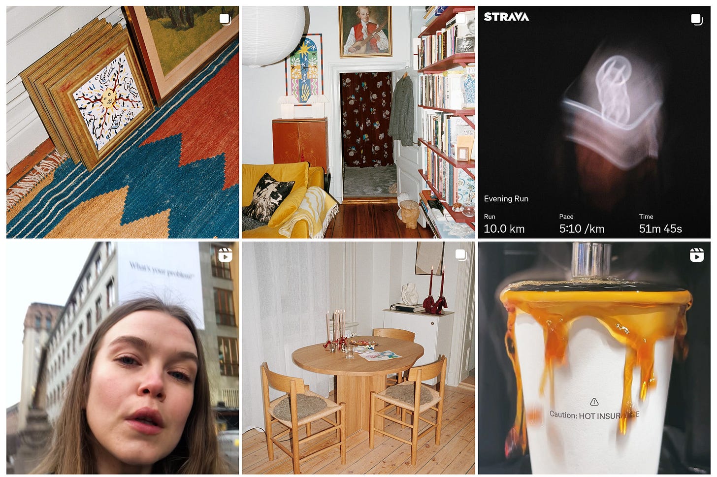
In a previous campaign, Hedvig launched pop-up stores featuring modern and vintage furniture pieces, which were given away with every home insurance policy.
This campaign proves that being a digital-native brand doesn’t mean everything has to happen online. Hedvig shows how to connect with their audience in authentic, meaningful ways, something their competitors struggle to replicate.
Their approach is a masterclass in blending online presence with offline experiences, showing how digital brands can feel real, tangible, and relatable.
A clean and minimal website
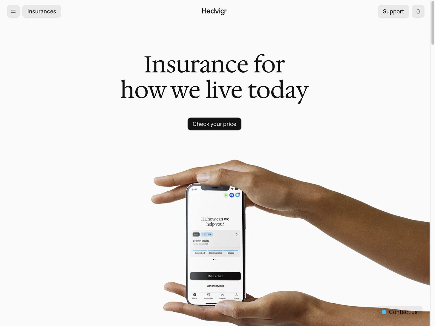
As always, less is more. Hedvig masterfully blends its product offering with authentic, relatable imagery that resonates with its audience.
It’s minimal, but purposeful. The value proposition is front and centre, highlighting a digital promise of efficiency, while the visuals are filled with empathy.
Even the product mockups carry subtle meanings. Take, for example, the below image of hands gently holding a phone: it conveys a sense of protection and being in good hands.
Hedvig proves that simplicity doesn’t mean sacrificing emotion, it means delivering clarity with heart.
The brand imagery feels authentic and unfiltered. The photos look natural, seamlessly embedded into everyday life, as if you took them yourself.
There are no filters, no staged perfection, and no fluff - just real life, captured in a way that resonates deeply with Hedvig’s audience. This approach makes the brand feel genuine, approachable, and trustworthy.
➡️ Check it out: https://www.hedvig.com/se-en
Plaid: Pay by Bank gets a refresh
Plaid, one of the leading Pay by Bank platforms, has just unveiled its rebrand, dubbed as “The Fabric of Financial Progress.”
The rebrand, developed by Plaid’s internal brand, creative, and product design teams, draws inspiration from the intricate art and design of global paper currencies.
A Nod to Financial Heritage:
Guilloche patterns
Woodcut illustrations
Holographic strips
These are the visual languages of trust and security that have been tied to money for centuries. Plaid reimagines these elements to mirror their vision of a vibrant, digital financial ecosystem.
Bridging the Old with the New
Plaid’s rebrand elegantly bridges the historical trust in physical currency with the dynamic potential of digital finance. It shows that while the tools may evolve, the values and foundations of finance - trust, security, and progress - remain constant.
It’s a fresh, modern take on a brand that sits at the heart of the evolving financial landscape.
➡️ Check it out: https://plaid.com/ & https://plaid.com/blog/plaid-the-fabric-of-financial-progress/
The new woo
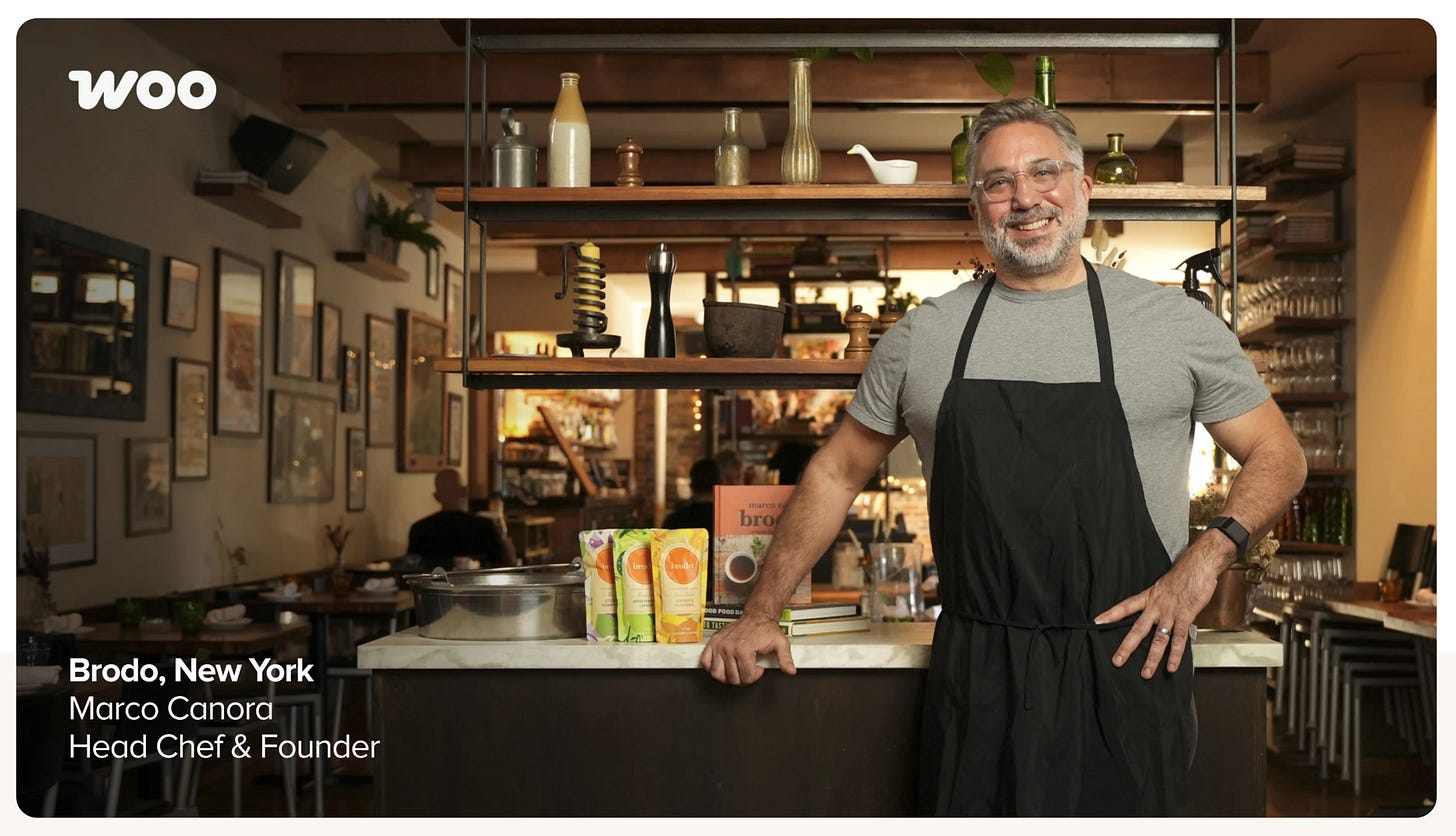
WooCommerce, WordPress’ infamous eCommerce plugin, has unveiled its latest rebrand alongside Plaid this week.
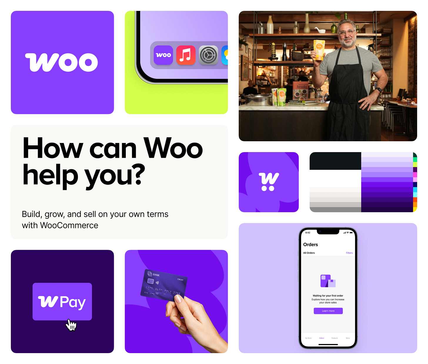
The refresh features a new logo, a refined colour palette, and a modernised identity that reflects Woo’s evolving vision.
But according to Woo, this is more than just a visual update. It signals a new direction towards becoming a more integrated, user-friendly platform, all while remaining true to its open-source roots.
Standing out in a saas-dominated market
By focusing on flexibility, customisability, and true ownership, Woo aims to differentiate itself in an eCommerce space increasingly dominated by saas giants.
Their new tagline, “Sell on your own terms” puts customer success stories at the forefront, emphasising their core values of ownership, adaptability, and a thriving global community.
With this rebrand, WooCommerce reinforces its position as a platform that empowers sellers to build businesses on their terms - without sacrificing control.
➡️ Check it out: https://woocommerce.com/
About Dom Monhardt, founder of one-fs.com
I am a French technologist and product leader living in Dubai, with 15+ years of experience in building cutting-edge and innovative digital experiences.
I am interested in the intersection of business, design, and technology and am deeply passionate about the fintech and digital banking world.


