

Beyond UX: Building Fintech That Wows
Lessons in vision, innovation, and delivering magic

Building a standout fintech product isn’t just about great UX. It’s about vision, culture, technical excellence, framing and delivering magic that captivates users.
In this article, we’ll cover:
❌ Why Don Norman was wrong about Apple’s usability hurdles
➡️ Why good UX isn’t enough to drive desirability. A lesson from HSBC’s Zing.
🔎 The risks of overusing user research.
📱 Apple’s intuition-led approach to product innovation.
🖼️ The power of framing your product. A lesson from Wise.
👩💻 Why technical excellence and vision outweigh execution.
✨ How delivering magic can overcome usability hurdles.
This week I stumbled upon an old post by Don Norman, the godfather of User Experience, critiquing Apple’s focus on aesthetics over usability.
“Apple has gotten carried away by the slick, minimalist appearance of their products at the expense of ease of use, understandability, and the ability to do complex operations without ever looking at the manual.
Today, the products are beautiful, but for many of us, confusing. The fonts are pleasant to the eye, but difficult to read. The principle of "discoverability" has been lost. The only way to know what to do in many situations is to have memorized the action. The screens offer no assistance in remembering whether one should swipe left or right, up or down, one finger or two. Or three. One tap or two. I frequently have to "re-read the manual," which means going back to the control panel to review the multiple finger swipes -- which are not even the same for all devices: the magic mouse is different from the trackpad which is different from the iPad.
Inscrutable icons litter the face of the devices even though the research community has long demonstrated that people cannot remember the meaning of more than a small number of icons. Icon plus label is superior to icon alone or label alone. Who can remember what each icon means? Not me.
The modern gesture devices lack feedback, they lack "undo." Menus were banished, evidently because they might detract from the lovely minimalist appearance, despite the conflict between that minimalism and the essential prompts and signifiers that simplify the person's ability to use and understand the product…” Read the full article
I’m a huge fan of Don Norman (check out his book The Design of Everyday Things) and an equally big fan of Apple for the quality and excellence of their products.
Don’s critique is valid to an extent, I also often struggle with new Apple features. For example, I was lost and annoyed when Apple removed the iconic iPhone home button, replacing TouchID with FaceID. But today, I’ve completely adapted and never looked back.
At the time of Don’s post in 2015, Apple generated around $230B in revenue and had 570 million active iPhones. Norman predicted Apple’s downfall due to its lack of usability sense.
But here we are, 10 years later. Apple is thriving as the world’s most valuable company, with a $3.4T market cap, 1.5B active iPhones, and a 60% market share in the US. Today, nearly 80% of Gen Z prefers Apple over rivals.
These numbers tell us one thing: usability is not a primary driver of desirability.
The Problem with User Research
Usability is ever-evolving. What Don Norman considered poor usability may not be an issue for Gen Z or Generation Alpha.
Norman’s main critique focused on Apple’s gestures, but young children now navigate iPads and iPhones with ease - it’s second nature to them.
Moving beyond Apple, recent innovations like ChatGPT or MidJourney’s initial Discord-based interface were also criticised for poor usability. Yet, when the outcome is “magical,” usability takes a back seat. People quickly learn to adapt.
As Henry Ford famously said: “If I had asked people what they wanted, they would have said faster horses.” User research often refine existing paradigms rather than inspire the creation of entirely new ones.
Banking’s Misguided Focus on Usability
This week, I was reminded of the usability efforts in traditional banking. UK banking giants like HSBC, Barclays, Lloyds, and NatWest invest millions in user research and usability testing, employing methods like eye-tracking, card sorting, and session replays. HSBC alone has 140 UX staff listed on LinkedIn (compared to Monzo’s dozen).
Despite this, HSBC scores far lower in service quality than Monzo (56% vs. Monzo’s 80%) source).
HSBC’s Zing app, launched last year, is a prime example. Even with good aesthetics and usability, it lacks desirability.
This overemphasis on usability can blind leadership to innovation and discourage risk-taking. When organisations rely solely on feedback loops from user research, they risk creating products that are technically efficient but fail to inspire or delight users.
User research is important and useful. But too much reliance and emphasis on it can stifle innovation.
Building the Products of the Future
Apple stands out by taking a fundamentally different approach. While they take usability seriously and employ some of the best experts in the world, they do not rely on user research to dictate their product direction. Instead, they trust the intuition and expertise of their senior leadership to make bold decisions.
Don Norman criticised Apple’s direction as being detrimental to usability, but Apple was ahead of its time, creating intuitive experiences for future generations. Their confidence in building products that challenge current norms has resulted in a market share and customer loyalty unmatched by their competitors.
Apple’s top-down product strategy is grounded in the vision of its leaders, who trust their instincts and take calculated risks. This approach fosters groundbreaking innovation.
A fascinating deep dive into Apple’s organisational culture can be found in the Harvard Business Review’s How Apple is Organized for Innovation. It’s a must-read for anyone curious about how Apple consistently produces revolutionary products.
How Apple is Organized for Innovation - 11 pages
While user research remains important, Apple’s success illustrates the value of balancing it with visionary leadership. Bold decisions based on intuition and expertise, rather than solely data or tests, allow companies to innovate and create products that not only work well but also captivate users.
Leaders should focus on understanding when usability tests provide real value and when they may stifle creativity. Apple’s approach shows that trusting expert judgment can lead to products that are not just functional, but magical.
The Halo effect
Marketing profoundly impacts product perception and it’s first use.
Take Wise, for example. Its bold campaigns - marching in underwear through London or walking in hazmat suits in Barcelona, positioned it as a transparency-driven underdog fighting against banks.
Compare this with HSBC’s bland Zing marketing: “Live your best international life” or “We’ve got your back.” There’s no spark to rally excitement, it’s as bland as a chatgpt stance.
The halo effect, a cognitive bias where one trait shapes overall perception, is real.
The famous “Warm-Cold” study by Harold H. Kelley in the 1950s is a great example. Two groups of students were given identical descriptions of their guest lecturer, except for one key difference: in one group, the lecturer was described as a warm person, while in the other, as a cold person.
The lecture itself was identical, but afterwards, students were asked to rate the lecturer’s personality. The group that was told the lecturer was warm rated them as approachable, likeable, and effective, while the group that was told the lecturer was cold gave unfavourable ratings - despite attending the same lecture.
Consider how the framing of your product will influence how it is perceived and used.
So where do we go from here?
Here’s what we’ve covered so far:
Usability is not a factor for desirability.
Too much focus on usability can stifle innovation.
More people working on UX and more usability tests do not guarantee better customer satisfaction.
Asking people what they want won’t lead to innovation.
Innovative tools delivering clear value outweigh usability issues.
Apple uses a top-down product strategy, favouring the intuition of senior leadership over data or usability testing.
Marketing significantly impacts the perception and first use of a product.
There’s a fine balance between all these concepts, and successful products seem to follow similar patterns:
Technical Excellence
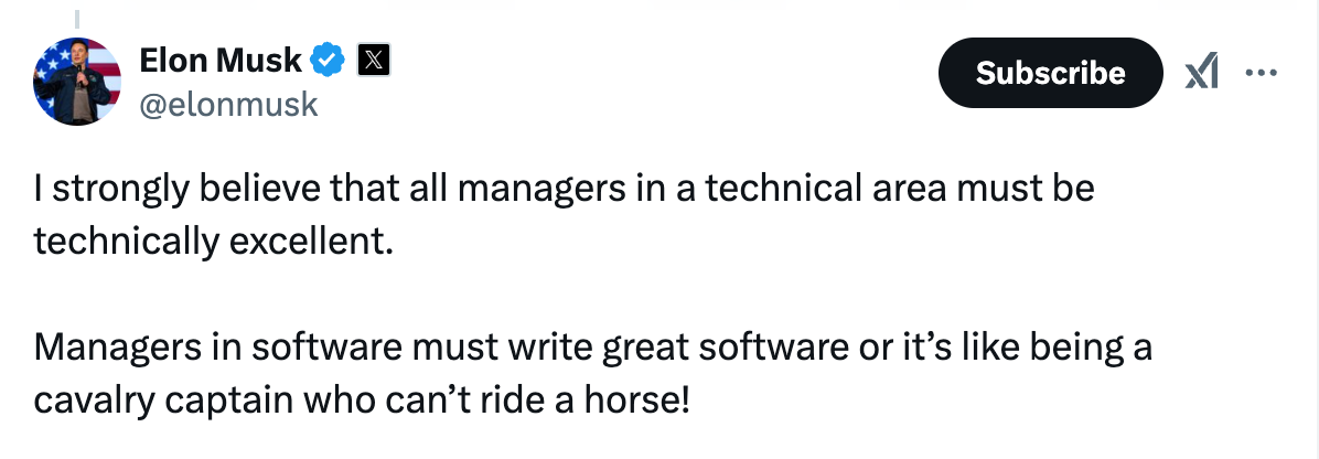
As Elon Musk said, “You can’t be a cavalry captain if you can’t ride a horse.” Fintech is short for financial technology, and leaders in the space - whether in fintech or digital banking, must excel in technology.
Another surprising observation from my last role in banking was how few employees actually experienced the product they were building. This was not an anomaly but a common occurrence. For instance, a mortgage product manager who has never purchased a home will struggle to create the best mortgage product.
Great vision over great execution
A strong vision outweighs even the best execution. We’ve seen this with HSBC’s Zing app. It’s a well-built product, but it lacks desirability. To create the next big fintech success, the focus must be on revolutionary concepts that won’t emerge from focus groups but from visionary leadership.
Quantity doesn’t outweigh quality. A small, talented team with the right culture and vision will consistently outperform a larger team of great executors.
For example, I personally believe we’ll see something extraordinary with X.com - leveraging the combined power of social media, AI, crypto (stablecoins and blockchain tech), and telecommunication advances like Starlink to create a truly unstoppable global product. Learn more about X.com here
Bold framing
Visit any fintech or digital bank website, and you’ll see the same tired claims: “We’re better, simpler, faster, for you” These attributes have become bland and uninspiring, they don’t rally people or create excitement about the product.
Learn from Wise. They crafted a bold narrative, taking a stand against banks, and backed it up with visible action. They didn’t just tell a story; they lived it.
Be bold. Walk the talk. Create a story that resonates.
Deliver magic
Above all, deliver magic. It will outweigh usability challenges. We’ve seen this with AI tools recently and the opposite with web3 products. The best tech paired with no “magic” doesn’t gain traction.
Magic happens when you 10x or exceed your customers’ expectations. It means creating new paradigms, venturing into uncharted territories, and building something the world has never seen before.
This concept deserves an entire article, but the essence is simple: make your product so exceptional that it transcends usability hurdles and wows your customers.

About Dom Monhardt, founder of one-fs.com
I am a French technologist and product leader living in Dubai, with 15+ years of experience in building cutting-edge and innovative digital experiences.
I am interested in the intersection of business, design, and technology and am deeply passionate about the fintech and digital banking world.